Power System Flexibility
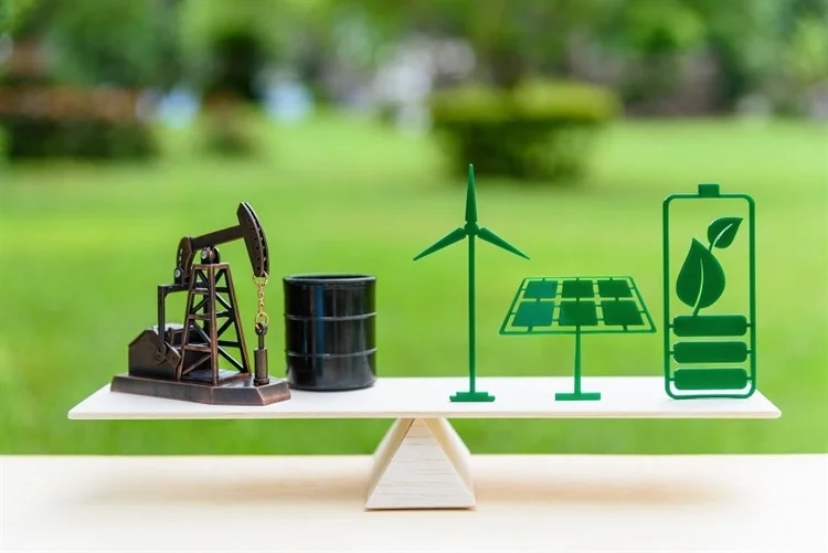
Image Credits: William Potter / Shutterstock.com
My research addresses energy system flexibility challenges posed by the intermittent nature of renewable energies (solar, wind). It employs optimization methodologies and techno-economic modeling.
The developed models help to understand optimal integration of storage technologies (e.g., Li-ion batteries, hydrogen, pumped hydro storage) to effectively match renewable energy supply with demand, considering regional climates and electricity demand patterns.
Related Publications
-
Clerjon, A., Perdu, F. (2022).
Matching intermittent electricity supply and demand with electricity storage – An optimization based on a time scale analysis. Energy, Vol. 241. -
Clerjon, A., Perdu, F. (2019).
Matching intermittency and electricity storage characteristics through time scale analysis: an energy return on investment comparison. Energy & Environmental Science, Vol. 12. -
Duval, J., Clerjon, A., Parmentier, P., Perdu, F. (2025).
Optimal deployment of wind and solar electricity considering regional climates and demand patterns to minimize dispatchable supply. ECOS2025 Conference Proceedings, Paris. -
Clerjon, A. (2021).
Analysis and modeling of the impacts of intermittent renewable energies on the French electricity system. PhD Thesis, Université Grenoble Alpes.
Every project has a beautiful feature showcase page. It’s easy to include images in a flexible 3-column grid format. Make your photos 1/3, 2/3, or full width.
To give your project a background in the portfolio page, just add the img tag to the front matter like so:
---
layout: page
title: project
description: a project with a background image
img: /assets/img/12.jpg
---


You can also put regular text between your rows of images. Say you wanted to write a little bit about your project before you posted the rest of the images. You describe how you toiled, sweated, bled for your project, and then… you reveal its glory in the next row of images.


The code is simple. Just wrap your images with <div class="col-sm"> and place them inside <div class="row"> (read more about the Bootstrap Grid system). To make images responsive, add img-fluid class to each; for rounded corners and shadows use rounded and z-depth-1 classes. Here’s the code for the last row of images above:
<div class="row justify-content-sm-center">
  <div class="col-sm-8 mt-3 mt-md-0">
    {% include figure.liquid path="assets/img/6.jpg" title="example image" class="img-fluid rounded z-depth-1" %}
  </div>
  <div class="col-sm-4 mt-3 mt-md-0">
    {% include figure.liquid path="assets/img/11.jpg" title="example image" class="img-fluid rounded z-depth-1" %}
  </div>
</div>